The above chart shows the monthly averages for
temperature and precipitation for Eau Claire. This
kind of data is necessary for understanding climate
change; however, I will be using it to put the records
of this year into context, to see if the conditions this
year were normal, below normal, or above normal.
Left: this is data for January of this year. It includes temperature, rainfall, and prominent wind direction. The most striking feature is the high temperatures in early January. These are very out of the norm for Wisconsin. The graph shows somewhere around 28 degrees to be the average temperature for January this is well above the historic avg. of 10 degrees!
Right: Again the temperature here is way above the average of about 15
degrees. Barely more than one day was spent below the average.
Left: March is the closest to normal of these months for the historic avg. and there is a general upward trend of temperature. The first three months of this year feature west winds prominently. I think this correlates to the low amount of precipitation in these months because west winds are drawn from a dry continental air mass.
Right: April approaches the avg. temperature of about 45, only going above by around 5 degrees. It has by far the most precipitation and a prominent southeast wind. This makes sense because southeast winds are often a good indicator of impending rain.
Here I have data for several cities relatively close to Eau Claire. By comparing it to the similar chart at the top of this page I can identify if there are microclimate factors within the region which are effecting Eau claire.


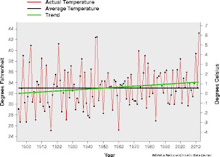
Right: The graphs to the side and below track the actual and average temperature and precipitation across a century for the month of March. It also projects a trend line(green and red, respectively). There isn't much of a trend for precipitation but it is in a slightly downward direction. Temperature on the other hand is rather dramatically increasing. From the above chart March '11 seems to follow this trend. This is an important analysis to look at when considering climate shift vs. global warming vs. an isolated occurrence.

No comments:
Post a Comment